
THE COLORS OF WELCOMING – From nature to your walls, let life pulse through your home!

Updated: Oct 26, 2025
Before we dive into the topic, I want to give you a warm welcome once again and apologize for my long absence here on the blog. From now on, posts might be more occasional, but they'll continue to be filled with heart, essence, tips, and wonderful information, just as always, for my dear readers!
Now let’s get into it: Have you had enough of that snow-white look on your walls? Or maybe those classic pastel tones used in new projects, chosen without much thought about which colors actually represent you and make you feel at home? Or even those carefully picked shades, unusual or not, that were still selected without much reflection, without truly considering your personal taste, trends aside, and especially without thinking about the emotions you want (or don’t want) to feel in each space, and how to use color to create (or avoid) those feelings through your walls. Let’s get into the details!
Not rarely, and I’d even say quite often, the colors we choose for our walls are picked almost on autopilot, without much thought. Sometimes it's because of current trends, or simply because architects and designers tend to stick with the same contemporary, repetitive styles that lack real personality, especially in so-called “luxury” or “high-end” projects. If that style speaks to you and truly reflects your personality, that’s totally fine, and maybe this content isn’t for you, but if you’ve decided to keep reading, welcome to a little deeper reflection. I invite you to open yourself up to bolder choices and new sensations by selecting colors that break away from the standard palette without fear, adding that touch of personality and warmth to the corners of your home, something you might have been looking for all along, without even realizing it.
It also happens that many people don’t really value the intentional choice of unconventional colors simply because they don’t want the hassle of having to carefully choose even more elements to match those colors. It's often just about practicality, they’re content with a minimal layout and organization that meet basic functions and needs. And that’s totally okay, but you'll find my honest opinion and advice on that in another post here on the blog, where I talk about the difference between a house and a home.
So, let’s get to the point: colors are vital in our homes because they have the power to evoke sensations, emotions and inspiration. They also bring personality to our spaces, communicating our spirit, offering comfort and passing on good feelings to those who visit. After all, it’s a beautiful thing when we pour our love and care into creating a home that reflects who we are, and a friend walks in and says, “Wow, what a cozy home you have!” or “It feels so good to be here!” or “Your place has such great energy!”
To me, honestly, that’s almost a blessing. If the people we care about feel good and inspired in a space that took our effort and love, that’s a life purpose fulfilled. Goodness and love turned into our own well-being, and the well-being of others that spreads endlessly, is, in my view, humanity’s greatest purpose. And we often have no idea how powerful and contagious even the smallest act of love can be.
Alright, without further delay, what colors can be used to create a cozier and truly personalized home, according to Adriely? Personally, I love earthy tones, from some rosy hues to deeper browns, certain shades of green and even a few bluish tones. These are colors we find in the nature of plants, in the soil beneath our feet, and trust me, if you’re ever unsure about whether certain colors go well together, just look to nature! Look closely at certain plants and try mimicking their color combinations in your spaces, depending on the feeling you want to create. It’s impossible to go wrong!
EARTHY TONES


GREENS AND BLUISH
The green tones I love the most are variations of olive and darker, more subdued shades. As for the bluish tones, I prefer dark and muted blues that actually lean toward green, like teal shades.


These are bold colors, some more dramatic than others, it all depends on the vibe you want to create in your space, regardless of your decorating style. One thing is certain: a room instantly steps out of the ordinary when a pop of color comes into play!
NATURE AS A COLOR PALETTE SUGGESTION
Isn’t there any more wonderful source of inspiration than nature? Here are some plant foliage species I love and that inspire me when creating compositions. They even work great for outfit inspiration! Hahahaha


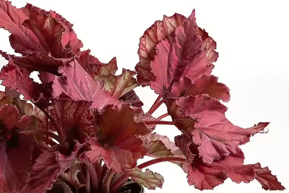

See how the beauty of plants can be so inspiring? Compare their colors with those of the previously shown spaces and you’ll see how we can draw tone variations for our walls. Some don’t even need adjusting, as they’re already perfect to replicate.
Ah, but then you might say “Well, I’m renting and don’t want to spend money on something temporary.” I totally get it, and we’ve got a solution (unfortunately not for the walls, but definitely for everything else you can take with you): bring color into your space through décor pieces and textures!
For example, if you have a white or neutral wall in your living room, bring it to life with a gallery of frames in various sizes and personalized styles, where the colors match, for example, with the pillows and throw blanket on the sofa. Other decorative objects can (and should) also harmonize with this composition. Let your soul guide your inspiration when choosing each item, making sure it holds meaning for you and carries memories and stories of its own!

That’s it for now! I hope my rise from the ashes has left you feeling happy and inspired to give your home a colorful, plant-filled boost! :D
See you in the next post!


Comments